
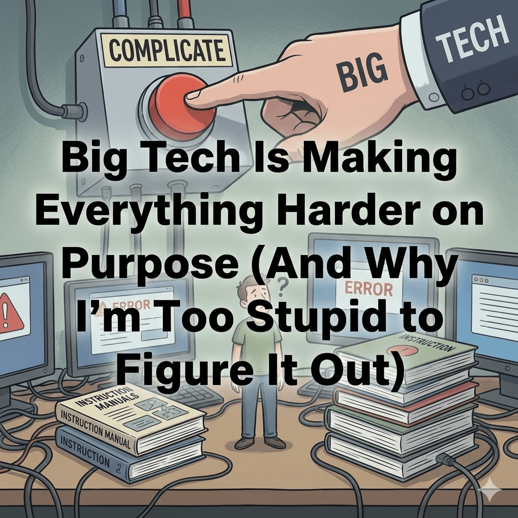
(And Why I’m Too Stupid to Figure It Out)
It has always amazed me how complex Big Tech has become and how poor their UI and UX are, given how much money they make. A simple task can take hours to slog through if you aren’t an IT person and only update certain things occasionally. If you’re stupid-smart like me—intelligent enough to know there should be a solution but not quite smart enough to remember what you did last time—you end up falling down rabbit holes of mostly useless YouTube videos and forum posts about the wrong issue entirely. AI has helped somewhat, but it often gives me outdated information, which somehow makes everything worse.
And if you have kids? Multiply that frustration by however many children you’re trying to keep off TikTok. Want to advertise your business on social media or add products to Google Shopping? Better clear your schedule and say goodbye to your sanity. The level of complexity and lack of intuition in these platforms is mind-blowing given their practically unlimited resources.
Let me walk you through my personal tour of Big Tech hell.
Apple: Remember When Things ‘Just Worked’?
I became a Mac user long ago when it was the primary OS in the creative industry. It was refreshing after Windows—simpler, cleaner, with most of the technical guts hidden under the hood. The UI was intuitive. Your Apple ID was basically just a @mac.com email address. People became Mac fans because things just worked. No drivers needed. You could even upgrade your own RAM and hard drives. There was a whole cottage industry around Mac upgrades.
Then came the iPod. Then iTunes. Then the iPad. When the iPhone launched in 2007, I was ecstatic—I’d been waiting for someone to create a device that worked in one ecosystem so I wouldn’t need a BlackBerry while keeping everything synced. I got an iPhone the day after launch, purely by chance.
That’s when things started going downhill.
Apple shifted from focusing on creative professionals to chasing the casual user market—grandmothers on iPads, basically. But instead of maintaining that ‘just works’ philosophy, they started duct-taping features together. The endless authentication loops began: log in to iCloud, enter your username and password, but which username and password? Your Apple ID? Device password? Sometimes it’s clear, often it’s not.
They started hiding system folders so novices wouldn’t accidentally change things. They redesigned their computers so you couldn’t upgrade them yourself. And they eliminated that entire upgrade ecosystem in the process.
Then came Screen Time.
If anyone wants a case study in how not to build a feature, Apple’s Screen Time should be required reading. You have to create an iCloud account for your child. Now you’re juggling your credentials plus maybe 2x, 3x, or 4x sets of credentials for each kid depending on whether they have an iPhone, iPad, Mac, or all of the above.
Rather than nesting everything under the parent’s account, certain settings must be changed on the child’s device, others in iCloud. Two-factor authentication sends codes to random devices. Which user ID do you need? Which password are they asking for? Mine? Theirs? My Mac? Their Mac? My phone? Their phone?
Why does a kid under 16 even need a password for anything? Why can they turn off parental access to their devices? It’s a complete and utter clusterf**k. I’ve accidentally changed passwords countless times because I was using credentials for the wrong account.
And after all that? You still can’t control their screen time. I have everything locked down, and yet they find workarounds to watch mindless content—streamers crapping on things other people actually created. No-talent jackasses judging people who made something. But that’s another rant.
Oh, and iCloud storage? I kept getting notices that our family storage was full. I deleted unused items from my iPhone. It still said I was over the limit. I turned things off. I searched for what was using the space. Nothing made sense. After wasting hours, I gave up and paid the $0.99/month for extra storage. Now I’m up to the $1.99 plan. This level of complication and inefficiency is obviously by design.
Microsoft: The PIN That Shall Not Be Named
It’s not just Apple, though. Microsoft has its own special brand of torture.
We have an Xbox, so the kids need Xbox accounts. That brought a whole new layer of PINs, user IDs, and passwords. Even my Microsoft 365 subscription settings were confusing, but add Xbox and Family Safety into the mix? Holy Christ, it’s a nightmare.
That was just the tip of the iceberg. My son wanted a gaming PC, so I had to relearn the Windows environment. You need a Microsoft account, which I’d already set up for his Xbox. Fine. But when you log him into the PC, it’s not automatically under Family Safety. WHAT? They
know he’s 13. Why wouldn’t parental controls be enabled by default?
I tried to fix it. I added my account to the laptop—except I accidentally added it under his account, so I couldn’t remove him as admin. When logging in with my Microsoft account with two-factor authentication enabled, it asked for my PIN. Okay, sure. Except it wasn’t asking for my PIN. It was asking for my son’s laptop PIN.
The screen just said ‘Enter YOUR PIN.’ Not ‘Enter the device user’s PIN’ or ‘Enter [username]’s PIN.’ Just ‘YOUR PIN.’ I had just authenticated with super-secure two-factor authentication that my son would never have access to. How does asking for his PIN make any sense?
I spent hours adding and deleting accounts, trying to update PINs that required the PIN to update, creating local accounts that then asked for who-knows-what PIN. It took forever to realize it was always asking for the currently-logged-in user’s PIN. They expected me to just know this without specifying. How hard would it be to add ‘User: [username] PIN’ to that screen?
We have a family Game Pass subscription. You’d think it would automatically connect to his user ID since Microsoft knows he’s 13 and part of our family. Spoiler alert: of course it doesn’t. That would make too much sense.
Instead, I had to log into our Xbox account from his user profile on the PC after getting a warning that the users didn’t match. And when logging into the Xbox account, it asked for a PIN—whose PIN? Mine, right? That would make sense. But no. It was asking for my son’s PIN because I had to be logged into his account for this whole convoluted process to work.
What sort of sadist designed this?
Google: Where Common Sense Goes to Die
Surely Google must be better, right? They’re the masters of elegant simplicity! Except… no.
When Gmail first launched in 2004, the webmail interface left much to be desired. I had to use a mail app just to maintain my sanity. Fine—it was a free service, so expectations were low. But fast forward 20 years: Google became one of the wealthiest companies on the planet by harvesting user data, yet somehow made their ecosystem less intuitive over time.
I discovered the true depth of this dysfunction when trying to set up Google Shopping for my e-commerce store. I wanted my products visible on Google since they control most internet searches. Simple enough, right?
Wrong. I had to set up an ads account, then a business account, then manually link them in strange, unintuitive ways. I had a WooCommerce shop and tried to link the products directly. Of course that didn’t work. There were tokens and incompatibilities so convoluted I gave up, even with AI assistance that kept providing outdated information.
This was one reason I abandoned WordPress and WooCommerce for Shopify. It didn’t solve all the issues, but at least I could get it working.
Meta: An Unbelievable Nightmare
This leads me to Meta/Facebook/Instagram—an ecosystem so nightmarish it deserves its own circle of hell.
I wanted to set up an Instagram account that fed into a Facebook page for my business, with the ability to run ads. I also wanted to link my blog to a Facebook page for exposure. Full disclosure: I’m biased and hypocritical because I hate Facebook and Instagram and don’t use them personally, which may have tainted my perception. But boy, what a mess I created.
I tried using ChatGPT to solve these issues, but it kept giving me instructions for outdated interfaces. I apparently needed an ads account, a business account, and a user account—all separate accounts that needed to be manually linked. Why? I’m one user.
Turns out Facebook’s UI had me create accounts I didn’t actually need. I was just supposed to add pages to my personal account, then link them to the ads and business accounts on the backend. But the interface guided me to create new user accounts in both Facebook and Instagram, which completely screwed everything up.
It took weeks to unwind this web and get the feeds working together and ads running properly. ChatGPT hurt as much as it helped. I actually lost my mind and started typing in ALL CAPS, yelling at ChatGPT. I apologized later so they don’t come for me when AI takes over the world.
TikTok: Learning from the Worst
TikTok is similar to Facebook—you need multiple separate accounts to set up a business and store. They’re newer to this game, and nothing works or makes sense. I’m convinced they studied Google and Facebook as models for how dysfunctional to make their system.
If Big Tech is trying to simplify things for people like me, they’re failing spectacularly. And unfortunately, it appears much of this is by design.
The Real Question: Why Is It This Bad?
After subjecting myself to this digital torture, I started wondering: how did companies with virtually unlimited resources, top engineering talent, and decades of experience create systems this convoluted? Is it incompetence? Indifference? Or something more calculated?
The answer is all three, but especially the last one.
The Deliberate Complexity Trap
1. Feature Bloat as Growth Strategy
Big Tech companies don’t optimize for simplicity—they optimize for engagement metrics and revenue. Every new feature is designed to increase time spent on the platform or create a new revenue stream, not to make your life easier.
Apple could have made Screen Time simple and intuitive, but a convoluted system serves multiple purposes: it increases iCloud subscriptions (you need more storage for all those devices), it keeps you locked into the ecosystem (try switching to Android once you’ve set up three kids’ accounts), and it creates the illusion of robust parental controls while being functionally useless.
2. Friction as a Business Model
Companies deliberately make it hard to leave, modify settings, or understand what’s happening with your data. This friction serves several purposes:
The complexity makes you dependent on their ecosystem. Once you’ve spent 10 hours setting up family accounts, business pages, and ad campaigns, you’re less likely to start over with a competitor. The sunk cost fallacy keeps you trapped.
Confusing privacy settings mean most people never bother to turn off data collection. When opting out requires navigating seven submenus across three different apps, most people give up and accept default settings that benefit the company, not them.
Complex systems create more paid support opportunities. Can’t figure out your iCloud storage? Pay for more. Can’t manage your Google Workspace? Upgrade to premium support. Can’t navigate Facebook Ads Manager? Hire an agency or consultant.
3. The Acquisition Problem
When Big Tech acquires companies, they rarely integrate smoothly. Facebook bought Instagram but kept separate account systems and half-merged them in the most confusing way possible. Google acquired YouTube, and the comment system somehow got
worse. Microsoft bought LinkedIn and made sure the integration with Office 365 was just janky enough to be annoying.
Rather than rebuild from the ground up—which would be expensive and time-consuming—they duct-tape systems together, creating Frankenstein’s monsters of legacy code and competing authentication systems.
4. Organizational Dysfunction
Large tech companies suffer from internal silos. The team building iCloud has different priorities than the team building Screen Time. The Xbox team doesn’t talk to the Windows team. The Instagram team has different goals than the Facebook ads team.
Engineers get promoted for launching new features, not for simplifying existing ones. There’s no incentive to streamline a working system, even if it’s a nightmare for users. Performance reviews reward complexity and innovation, not elegance and usability.
5. Legal and Regulatory Compliance Theater
Some complexity is genuinely due to legal requirements—GDPR, COPPA, various privacy laws across jurisdictions. But companies often use compliance as an excuse to make things deliberately obtuse. They
could design clear, simple interfaces that meet legal requirements. Instead, they create Byzantine systems that technically comply while being functionally impossible to navigate.
This serves multiple purposes: it provides legal cover (‘We gave users control over their data!’), makes it unlikely people will exercise their rights, and creates plausible deniability when things go wrong.
6. The Dark Pattern Playbook
Many of the frustrations I experienced are ‘dark patterns’—design choices that trick or manipulate users into doing things that benefit the company. This includes:
Confirmshaming: ‘Are you sure you want to miss out on exclusive features?’ when you try to downgrade.
Hidden costs: Free accounts with artificially limited storage that force upgrades.
Forced continuity: Making it easy to subscribe but hard to cancel.
Misdirection: Burying important settings under multiple layers while making promoted features prominent.
Roach motel: Easy to get in (create accounts), hard to get out (delete data, close accounts).
Amazon: The Master of Complexity
Let’s not forget Amazon, which has perfected many of these tactics. Try setting up Amazon Business, Seller Central, and AWS under one organization. You’ll discover they’re separate universes with different login systems, billing structures, and support channels that barely communicate.
Want to cancel a subscription? Good luck finding that button—it’s buried under five layers of ‘Are you sure?’ and ‘What about this alternative offer instead?’ Want to manage your Prime Video channels? That’s separate from your Prime membership settings. Want to understand AWS billing? Congratulations, you now need a degree in cloud cost optimization.
Amazon’s complexity serves a clear purpose: keeping small sellers dependent on their platform, making it hard for businesses to calculate true costs, and ensuring consumers stay subscribed to services they’ve forgotten about. The confusion is a profit center.
The Bottom Line
Big Tech isn’t failing at simplicity—they’re succeeding at something else entirely. The complexity isn’t a bug; it’s a feature. These systems are working exactly as designed: to maximize engagement, extract data, increase subscription revenue, prevent platform switching, and maintain monopolistic control.
The real tragedy is that these companies could create elegant, intuitive systems that respect users’ time and intelligence. They have the resources, talent, and technology. They just don’t have the incentive.
When you’re a trillion-dollar company with a captive user base, why simplify? Complexity serves your interests better than clarity ever could. Every confusing setting, every redundant password, every ‘which PIN?’ moment is a small victory in the war to keep you dependent, confused, and subscribed.
As for me? I’m still stupid-smart enough to know this is all ridiculous, but not quite smart enough to escape the trap. I’ll keep paying my $1.99 for iCloud storage, cursing at my son’s PC, and apologizing to ChatGPT.
Because at the end of the day, that’s exactly what they’re counting on.

Leave a comment